|
| |||||||||

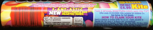
Go to the bottom of the page to see the special edition
printed smarties. |
|||||||||||||||||||||||
 |
|||||||||||||||||||||||
 |
|||||||||||||||||||||||
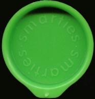
Here's the lid in that unique shade of green. Another highly sought after lid. But what's this below...?... |
|||||||||||||||||||||||
 |
|||||||||||||||||||||||
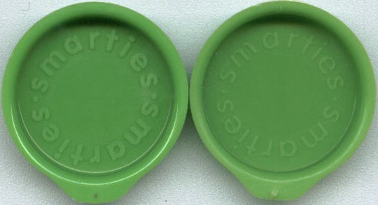
Two lids that look the same colour, but are from different
tube designs. There is a tiny difference in colour, but this may not
be deliberate on the part of Nestle. What is
definately different though is the font used on the top side of the
lid. The lid on the left is from the Limited Edition Designs trio of tubes BB
01/11/1994 and has the word 'smarties' written in a bold font. The
lid on the right hand side is the 'Bugs Life' lid and 'smarties' is
written in a more elegant font. Another headache for the lid
collector? |
|||||||||||||||||||||||
 |
|||||||||||||||||||||||
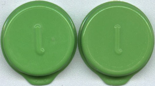
I only have one of each type of lid and by some strange
coincidence they both bear the letter 'L' in lower
case. |
|||||||||||||||||||||||
 |
|||||||||||||||||||||||
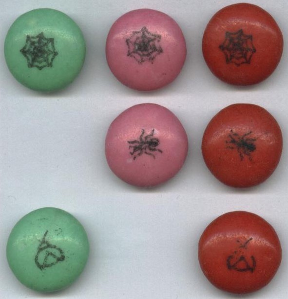
Check out the designs on these smarties.
Creepy! |
|||||||||||||||||||||||
 |
|||||||||||||||||||||||
| page created with Easy Designer |